How to Take Product Photos That Sell on Etsy
Updated 2026-06-21 · 8 min read
Plan your listing image set
Tick what you already have. Etsy gives you 10 slots — see what's still missing.
Styled photos
Text cards (infographics)
Still missing 12: Thumbnail / main shot, Lifestyle / in use, Detail close-ups, Size & scale, How it's made, Packaging, Variations, Key benefits card, Size guide, Materials & quality, Shipping & returns, FAQ. tusella can restyle your photos into the missing scenes and draft the copy for the missing cards — you approve every change before it publishes. See how →
On this page
Good Etsy product photos do one job: answer a shopper’s questions before they have to ask. You don’t need a studio or an expensive camera — a recent phone, a window, and a simple background cover most of it. The listing that sells shows the product clearly, from enough angles that there’s nothing left to wonder about.
Etsy gives every listing up to 20 image slots and one video. Treat them as a ranked checklist, not a free-for-all: every photo should remove one reason to hesitate. Below are the shots that sell, in the order we’d shoot them — fill the must-haves first, then add the closers your product needs.
The Etsy listing photos that actually sell
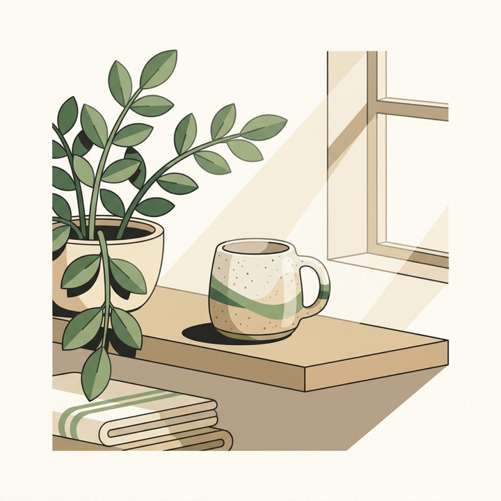
Here’s the must-have set at a glance — the same product, shown the way buyers need to see it before they’ll click Add to cart:





1. A video. Etsy surfaces it early — often in search, before the click — and shoppers who see a product “alive” buy more often. A few quiet seconds is plenty: turn it, open it, run the camera across the texture. Shoot without sound; most people browse muted.
2. The main shot. This is your search thumbnail, so it decides whether anyone clicks at all. One product, filling the frame, on a clean background, sharp and well-lit so it reads at small size. Win the thumbnail and you earn every view that follows.
3. In context. A lifestyle shot answers “where will this go, and does it fit my home?” — the product where it actually lives, in soft daylight, with minimal props so the focus stays on the item.
4. A detail close-up. Online, no one can pick your work up. A macro of the texture, grain, stitching, or glaze answers the quiet question “is this actually well made?” — and justifies a handmade price over a mass-market one.
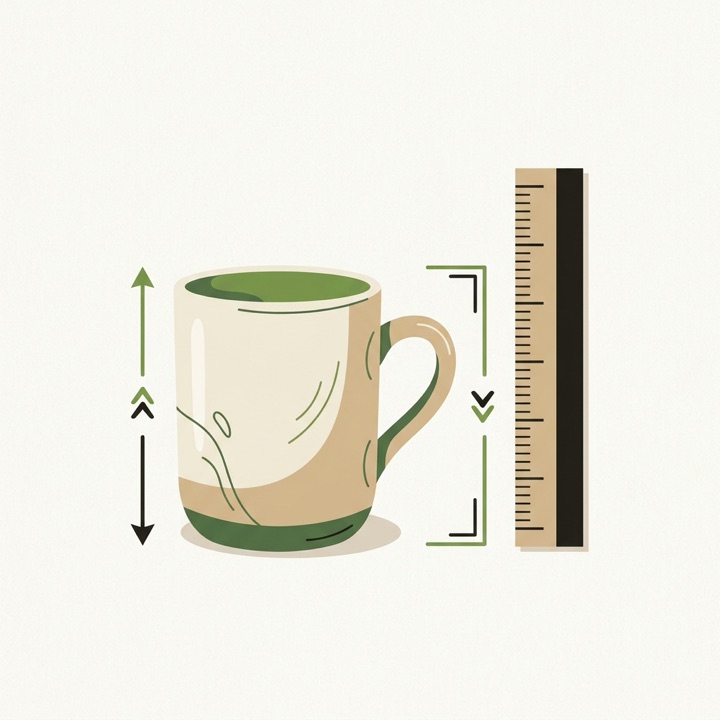
5. Scale. The most common reason for returns is “it wasn’t the size I pictured.” Show the item next to a hand, a familiar object, or with measurements on the image. A size people can feel beats millimetres they have to imagine.
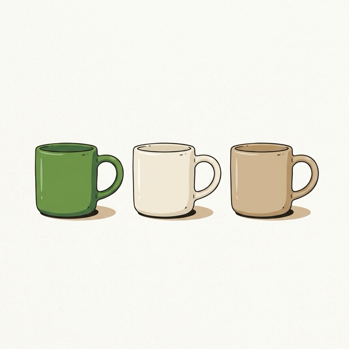
6. Variations. Every colour, material, or size in one frame answers “what are my options?” — it speeds the decision and shows the range of your shop at a glance.
7. In hand, with a person. People buy emotion, not objects. A hand holding or using the product shows scale and desire at the same time, and listings with people in them tend to convert better — especially for gifts.
8. Packaging. For gifts especially, the unboxing is part of what the buyer is paying for. Show the box, the tissue, the ribbon — and if it arrives gift-ready, say so. It removes the worry of “will this turn up in a plastic bag?”
If you still have slots, the strongest additions are a set or pairing shot (“buy two, save”) to lift the order value, a review card that borrows your best social proof (handy while a new listing has none of its own), and a gentle “each piece is unique” note for natural materials — it sets expectations on handmade variation and heads off unfair reviews before they happen.
Beyond the photo: the infographics that close the sale
Not every slot has to be a photo. A few of them work harder as simple infographics — an image carrying a little text that answers the exact question stalling the buyer. On Etsy these should feel clean and warm, never corporate: short phrases, soft design, mobile-first.
The ones that earn their slot most often:
- Key benefits — the 3–5 reasons to buy, scannable (“Handmade to order · Solid walnut · Food-safe · Ships in 3 days”).
- What’s included — essential for bundles, kits, printables, and personalised items; state what’s not included too (“frame not included”, “3 files: PNG, JPG, PDF”).
- Size guide — dimensions shown visually, a chart, or a scale reference. Size confusion is a top reason buyers hesitate.
- Materials & quality — answers “what is this made of, and how good is it?” and justifies a handmade price.
- Shipping — processing time, international, whether duties are covered, what happens if a package is lost. A real trust lever on higher-priced or overseas orders.
- FAQ — turn your most-asked messages into one image. If one buyer asks, others are wondering silently.
- Offer & guarantees — free shipping, satisfaction guarantee, “in time for the holidays if ordered by…”.
Use a “vs other shops” comparison sparingly — it can read aggressive in Etsy’s gentle marketplace, so only when your handmade quality is genuinely, demonstrably better, and keep it subtle.
How much text on an image
Your cards are read at a glance, on a phone, with a thumb hovering over “back.”
- 3–5 short phrases per image — one idea per image; if you need two, that’s two images.
- Bold, at least 20–24px, with high contrast (dark on light or light on dark — never grey on a busy photo).
- Clean beats clever. A card you can read instantly on a small screen outsells a beautiful one nobody can parse.
tusella drafts the words for most of these — the benefit lines, the what’s-included list, the FAQ answers — from your product details and Etsy’s real fee and keyword facts, so you drop finished copy onto a clean template instead of staring at a blank one. The styled scenes (lifestyle, scale, variations) come from the same restyle pass on your photos. As always, nothing reaches your shop until you approve it.
Do you need a professional camera for Etsy photos?
No. A recent phone in good light beats an expensive camera in bad light. Etsy’s own photography guidance comes down to three things you don’t have to buy: soft light, a simple background, and a steady camera.
- Shoot near a large window, out of harsh direct sun. Soft, even daylight flatters almost everything; midday glare and hard shadows don’t. A sheet of white paper or foam board bounces light back into the shadows for free.
- Keep the background plain and uncluttered so the product is the only thing competing for attention — a roll of paper, a clean tabletop, or a neutral wall is enough.
- Prop the phone or rest your elbows. A sharp photo in ordinary light beats a blurry one in perfect light every time.
Shoot more frames than you need and from more angles than you think you’ll use — it costs nothing, and you choose the best ones later.
Making the most of the photos you have
Most sellers already have decent raw shots; what holds them back is consistency — mismatched backgrounds, uneven lighting, a set that doesn’t look like it belongs together. That’s a styling problem, not a shooting problem, and it’s where AI restyling earns its place.
tusella restyles the photos you actually took: it can clean up and standardize the background, adjust the setting or lighting, and give a listing a consistent, on-brand set — working from your real product, not a fabricated one. The line we hold is the honest one: restyle and present your real item well, never invent a product you don’t sell or misrepresent what arrives. Every restyled image lands in the same review where you approve every change before it publishes. If you’re updating photos on listings that already exist, our guide to refreshing tired Etsy listings covers when a photo swap is worth it.
For Etsy’s own take, read The Ultimate Guide to Product Photography in the Seller Handbook. When your photos are ready, the words come next — see the Etsy SEO guide and the title and tag tools.
Frequently asked questions
How many photos can you have on an Etsy listing?
Etsy gives you up to 20 image slots per listing, plus one video. Use as many as you genuinely can — a main studio shot, detail close-ups, a scale or in-use photo, and variations. More relevant angles answer more buyer questions before they have to ask.
What photos should an Etsy listing have?
Cover a ranked range: a video, a clean main shot, the product in context, a detail close-up, a scale shot, variations, an in-hand photo, and packaging. Fill the must-haves first, then add closers. Each shot should remove one reason to hesitate.
Is a video worth it on an Etsy listing?
Yes. Etsy surfaces the video early — often before the click — and shoppers who see a product 'alive' are markedly more likely to buy. A few quiet seconds is enough: turn the product, open it, show the texture. Shoot it without sound, since most people browse muted.
Do I need a professional camera for Etsy photos?
No. A recent phone camera in good light beats an expensive camera in bad light. Etsy's own guidance prioritizes soft, natural lighting, an uncluttered background, and a steady shot over gear. Shoot near a large window, avoid harsh direct sun, and keep the phone steady or propped.
Can I use AI to edit my Etsy product photos?
You can restyle and clean up photos of your real product — adjust the background, lighting, or setting — and that's allowed. What you should not do is fabricate a product you don't sell or misrepresent what the buyer receives. tusella restyles the photos you actually shot; it doesn't invent products.
Why is the first photo so important on Etsy?
The first image is your thumbnail in search results — it's what decides whether anyone clicks. It needs to read clearly at small size: the product filling the frame, sharp, well-lit, on a clean background, with no text clutter. Win the thumbnail and you earn the click that everything else depends on.
Should Etsy listing images have text or infographics?
Some of them, yes. A few of your slots work harder as simple infographics — a benefits card, a what's-included list, a visual size guide, an FAQ, or a shipping note. They answer the exact questions that make a buyer hesitate, right where they're looking. Keep them clean and warm, not corporate: 3–5 short phrases, not paragraphs.
How much text should you put on an Etsy listing image?
Very little. Use 3–5 short phrases per image, one idea per image, in a bold font at least 20–24px so it's legible on a phone, with high contrast (dark on light or light on dark — never grey text on a busy photo). Etsy buyers scan; a card you can read at a glance beats a beautiful one nobody can parse on a 6-inch screen.
Made by Etsy sellers — try tusella
AI drafts your Etsy listings; you approve every change before it goes live.
Apply for early access